Strive App
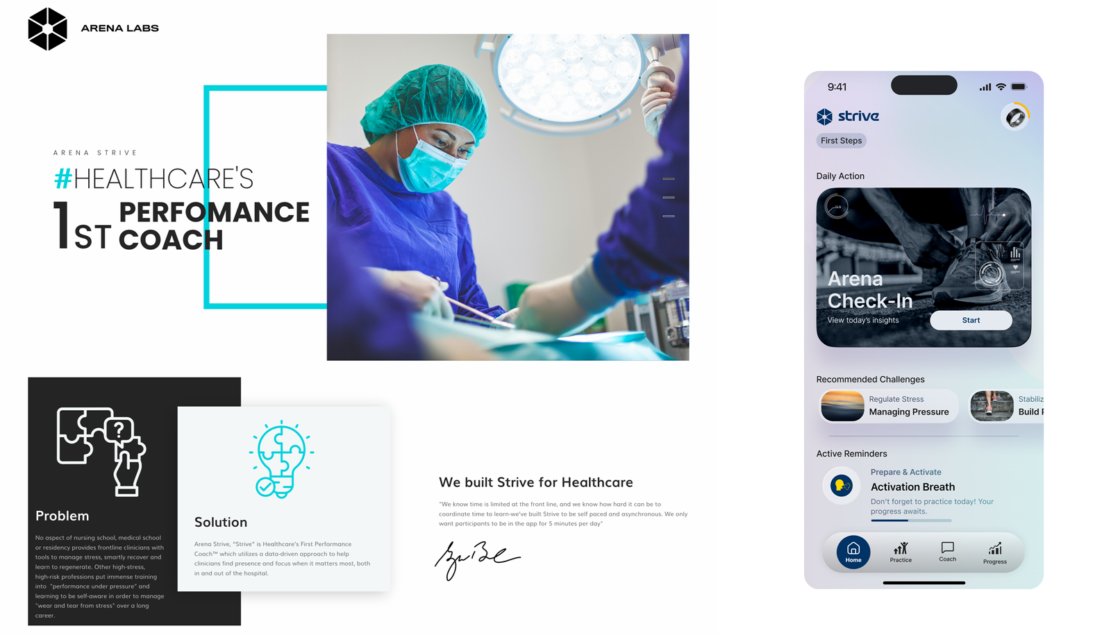
Arena Strive is Healthcare’s First Performance Coach™ and brings a data-driven approach to help clinicians find presence and focus when it matters most, both in and out of the hospital.
Task
Arena Check-In (ACI) Designed a seamless flow for users to report how they're feeling. Simplified data input with sliders, quick-select options, and clean UI to minimize effort. Provided insights and personalized tool recommendations based on user responses. Pre-Strive Baseline Assessments Created step-by-step assessments that broke complex inputs into manageable stages. Used progress indicators, smart defaults, and intuitive design to guide users and reduce drop-off. Profile Setup & Onboarding Designed flows to collect key user information, ensuring the experience felt easy and intuitive. Included auto-save, inline feedback, and visual cues to keep users on track. Overall, I focused on reducing friction, keeping users engaged, and helping them complete tasks with confidence—all while maintaining a clean and thoughtful design system for the app.
-
Strategy
Design Sprints, Workshops
-
Design
UI, UX, Animation, Product Design, Prototyping
-
Client
Arena Labs
-
Production
Design Sprints, Documentation
-
Platforms
Desktop, iOS
⬤ 01. Development Journey
Case Study: Redesigning the Arena Strive Dashboard
Background
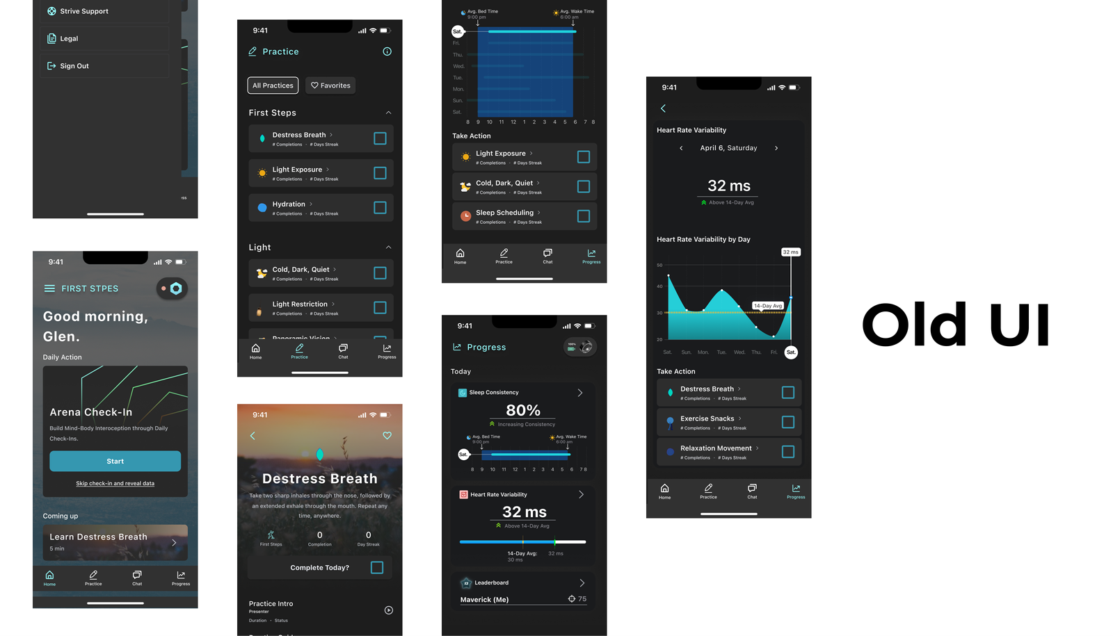
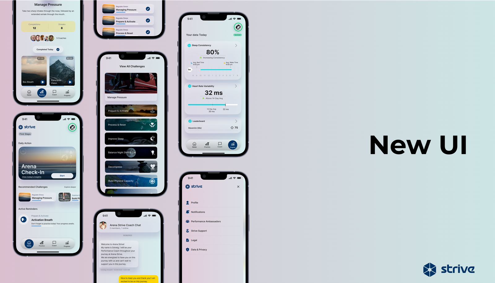
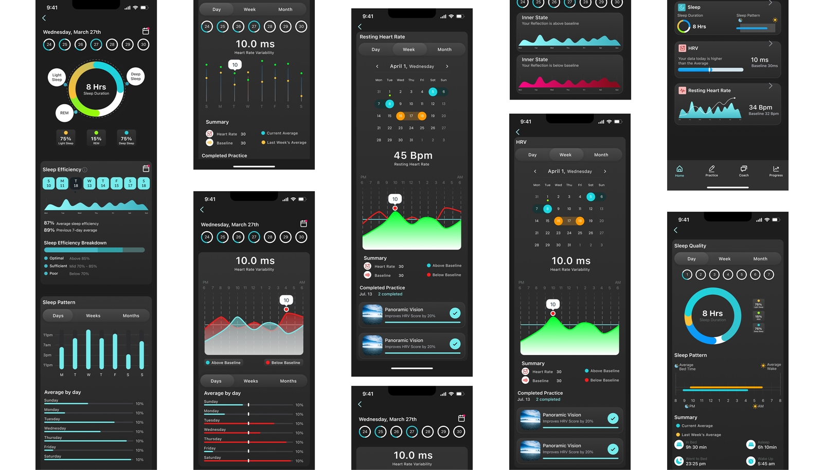
Strive’s mission is to empower users with actionable insights into their physical and mental well-being. Central to this mission is the Arena Strive Dashboard, a key product feature that helps users track metrics like Heart Rate Variability (HRV), sleep consistency, and daily mood trends. However, the original dashboard faced challenges that hindered user engagement and satisfaction.
Problem Statement
Low Engagement: Users found the dashboard static and uninspiring, which led to a drop in app retention rates.
Technical Bottlenecks: Real-time data synchronization was slow and inconsistent, causing frustration among users who relied on timely updates.
Lack of Personalization: The dashboard provided a one-size-fits-all approach, limiting its utility for users with diverse wellness goals and preferences.
Objectives
Enhance Engagement: Create an interface that encourages users to return regularly.
Optimize Performance: Ensure real-time data updates with seamless performance across devices.
Increase Personalization: Allow users to customize the dashboard based on their unique needs and preferences.
Methodolgy
The redesign followed a structured approach, blending user research, technical innovation, and agile collaboration over a two-week sprint.
1. Discovery Phase
Conducted interviews with 15 active users to identify pain points and feature requests.
Insights: Users wanted control over what metrics were displayed. A need for visually engaging graphs and animations to make data more digestible.
Competitive Analysis: Benchmarked against leading wellness apps (e.g., WHOOP, Fitbit) to understand best practices in data visualization and interactivity.
2. Ideation Phase
Product Designer- led brainstorming sessions to conceptualize user flows, wireframes & design systems.
Engineers – scoped the tech stack, opting for React for the front end and WebSockets for real-time data updates.
Head of Clinician Performance – ensured clinical accuracy and actionable insights in the content.
3. Prototyping Phase
Drag-and-drop functionality for widgets.
Hover effects for additional data insights.
Dynamic animations for transitions between states.
4. Technical Testing:
Engineers developed a prototype integrating live HRV and sleep data using AWS Lambda for serverless computing and D3.js for data visualization.
Performance tests ensured real-time updates within a 1-second latency.
5. Iteration Phase
Conducted weekly usability testing with 10 users to gather feedback. Key changes included:
- Simplifying navigation for quicker access to key metrics.
- Adjusting color contrast for accessibility compliance.
- Refining animations to balance aesthetics and app performance.
6. Implementation Phase
Finalized the design with Strive’s branding elements, including modern typography and a calming color palette.
Deployed modular widgets to the live app, enabling future scalability.
Solution
The redesigned Arena Strive Dashboard included the following key features:
- Real-Time Insights: Live updates powered by WebSockets ensured that data remained accurate and timely, even during high user loads.
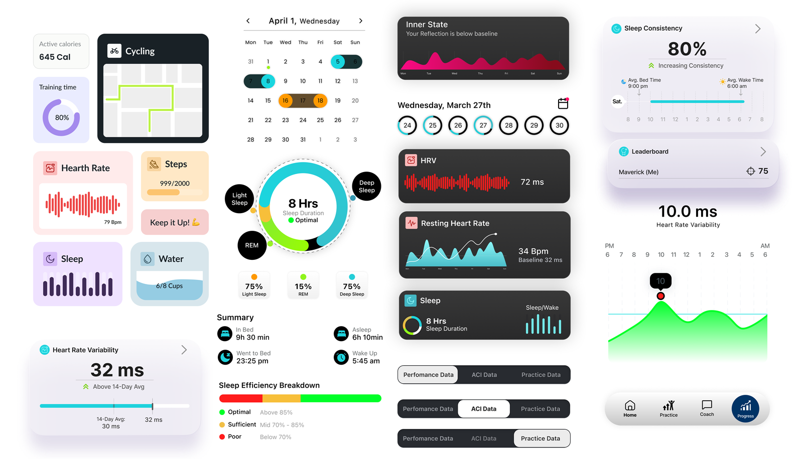
- Customizable Widgets: Users could drag and drop widgets, reorder them, and hide metrics they didn’t need. Example Widgets: HRV Trends, Sleep Consistency Graph, Daily Check-In Mood Tracker.
- Enhanced Visuals: Modern typography, subtle animations, and color-coded metrics made the interface intuitive and visually engaging. Tooltips provided additional context for data points, ensuring users could understand their metrics at a glance.
- Actionable Insights: Integrated recommendations (e.g., “Your HRV is low—try a guided breathing exercise”) gave users practical steps to improve their wellness.
Results
1. Increased Engagement
40% boost in weekly active users within the first month.
The average session duration increased from 5 to 9 minutes
2. Enhanced Retention
30% reduction in app churn rate over three months.
3.Positive User Feedback
95% of surveyed users rated the new dashboard as “easy to use” and “valuable.”
4 .Scalability
The modular design system enabled rapid development of additional widgets, supporting future product updates.
5.Team Efficiency
Cross-functional collaboration reduced development time, completing the redesign within two weeks.
Long-Term Impact
1.Incorporating In-App Feedback:
A new feature in the data tab allowed users to provide real-time feedback on displayed metrics. This ensured two critical outcomes:
- Users could confirm that the data shown aligned with their experiences.
- The system flagged inconsistencies, which were promptly reviewed by the QA and data teams for accuracy.
This approach fostered trust in the app’s analytics, leading to a 25% increase in users reporting satisfaction with data reliability.
2. Enhanced Notification System:
The introduction of a dynamic notification system delivered timely and relevant updates:
- ACI Reminders: Encouraged users to check in regularly, improving self-awareness and app interactions.
- Lesson and Tool Reminders: Personalized nudges based on user goals and past behaviors increased feature usage by 45%.
- Feedback showed that 80% of users found these notifications “helpful” and non-intrusive.
3. Improved Branding:
A comprehensive branding overhaul was executed to unify the app’s visual identity:
Modernized typography, color schemes, and iconography were applied across all features.
High-quality imagery, especially for Performance Medicine, was integrated to convey professionalism and trust. For example, the Performance Medicine visuals highlighted user empowerment and the science-backed approach, resonating with 90% of surveyed users.
The branding steps included:
Collaboration with marketing and design teams to draft guidelines.
Creation of reusable assets for consistency across campaigns and the app.
A/B testing of imagery to maximize emotional impact and user recall.
Result: Brand perception scores increased by 35%, with users describing the app as “inspiring” and “credible.”
4. Sustained Engagement Metrics:
The combination of these efforts ensured long-term gains in user engagement:
- Retention rates stabilized at a high level, with a 20% increase in year-over-year retention.
- Weekly active users continued to grow, supported by iterative updates based on ongoing feedback.
⬤ 02. UI
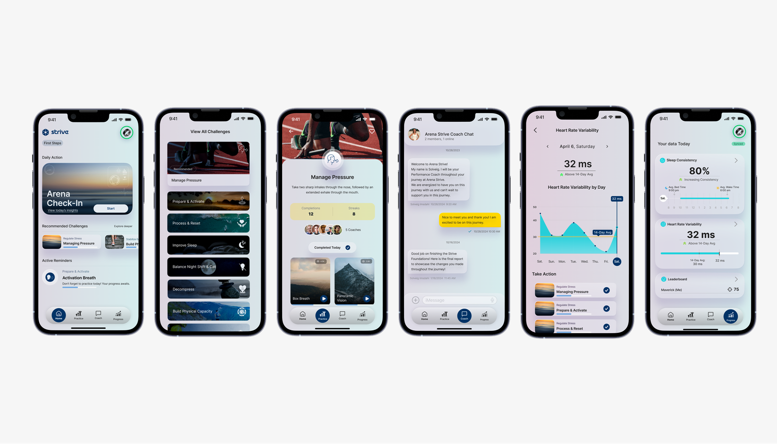
The Arena Strive Dashboard redesign not only addressed immediate challenges but also provided a scalable and adaptable framework for future product development, ensuring that Strive remains a leader in wellness technology.
| Primary #003366 | ◯ | |
Blue
| Primary #00CC66 | ◯ | |
Green
| A11Y Color #FC642D | ◯ | |
| R 255 G 255 B 255 |
White
| A11Y Color #ED2323 | ||
| R 0 G 0 B 0 |
Black
Typography
/ Scales
Typeface
Inter
Usage
Headlines
Aà
Strive’s typeface is simple, bold, easy for everyone to read, and instantly recognizable.
Whenever Strive appears, it is inscribed in a simple, yet attractive font, which signifies the strong image of the brand. Simplicity makes the Strive app design more appealing and engaging.
AaBbCcDdEeFfGgHhIiJjKkLlMmNnOoPpQqRrSsTtUuVvWwXxYyZz 0123456789
Typeface
Inter
Usage
Headlines
Typeface
Montserrat
Usage
Headlines
Key Takeaways for Similar Projects:
- Invest time in understanding user needs through qualitative research.
- Prioritize technical feasibility early to align design with development capabilities.
- Use modular design systems to balance scalability with rapid iteration.
- Test iteratively with real users to ensure the final product meets their expectations.