AI Product Design Prototyping March 1, 2025

Brain.fm UI/UX Build

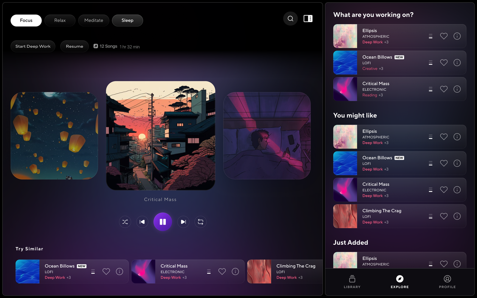
Brain.fm is a neuroscience-backed audio platform that helps users enter desired mental states—focus, relaxation, or sleep—within minutes. I was brought in to refine the Start screen UX, optimize the Focus session flow (which drives the majority of user engagement), and propose a cleaner, more intuitive UI system that improves user retention and conversion.

Task

Conversion Optimization, UX Strategy, Visual Refresh
  • Strategy

    Design Sprints, Workshops

  • Design

    UI, UX, Animation, Product Design, Prototyping

  • Client

    AKQA x LEGO

  • Production

    Design Sprints, Documentation

  • Platforms

    Desktop, iOS

Open Project
⬤ 01. Development Journey

Optimizing Focus Through Sound

The Opportunity

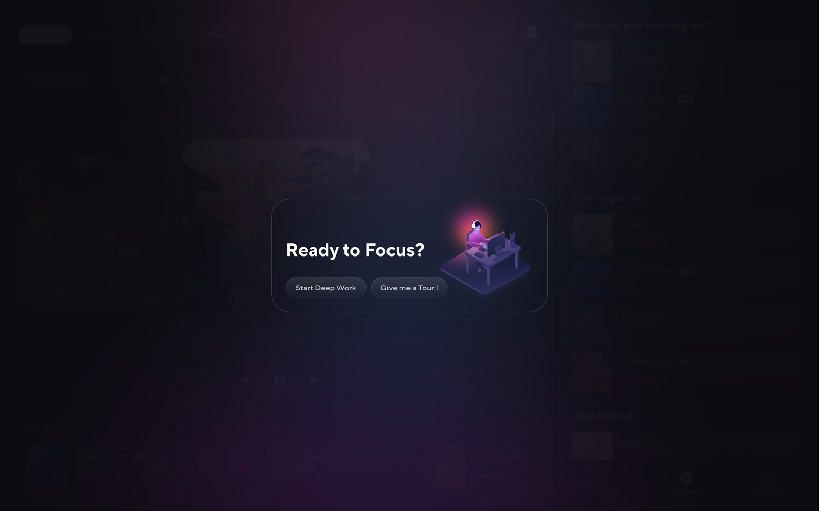
The existing Start screen didn’t prioritize user intent or behavior patterns. Focus sessions accounted for the majority of usage, yet were buried under extra taps. The UI also lacked a clear entry point and visual consistency across platforms.

Objectives

    • Conducted UX audits of the Start screen and user data analysis

    • Defined key user journeys based on data and behavior clusters

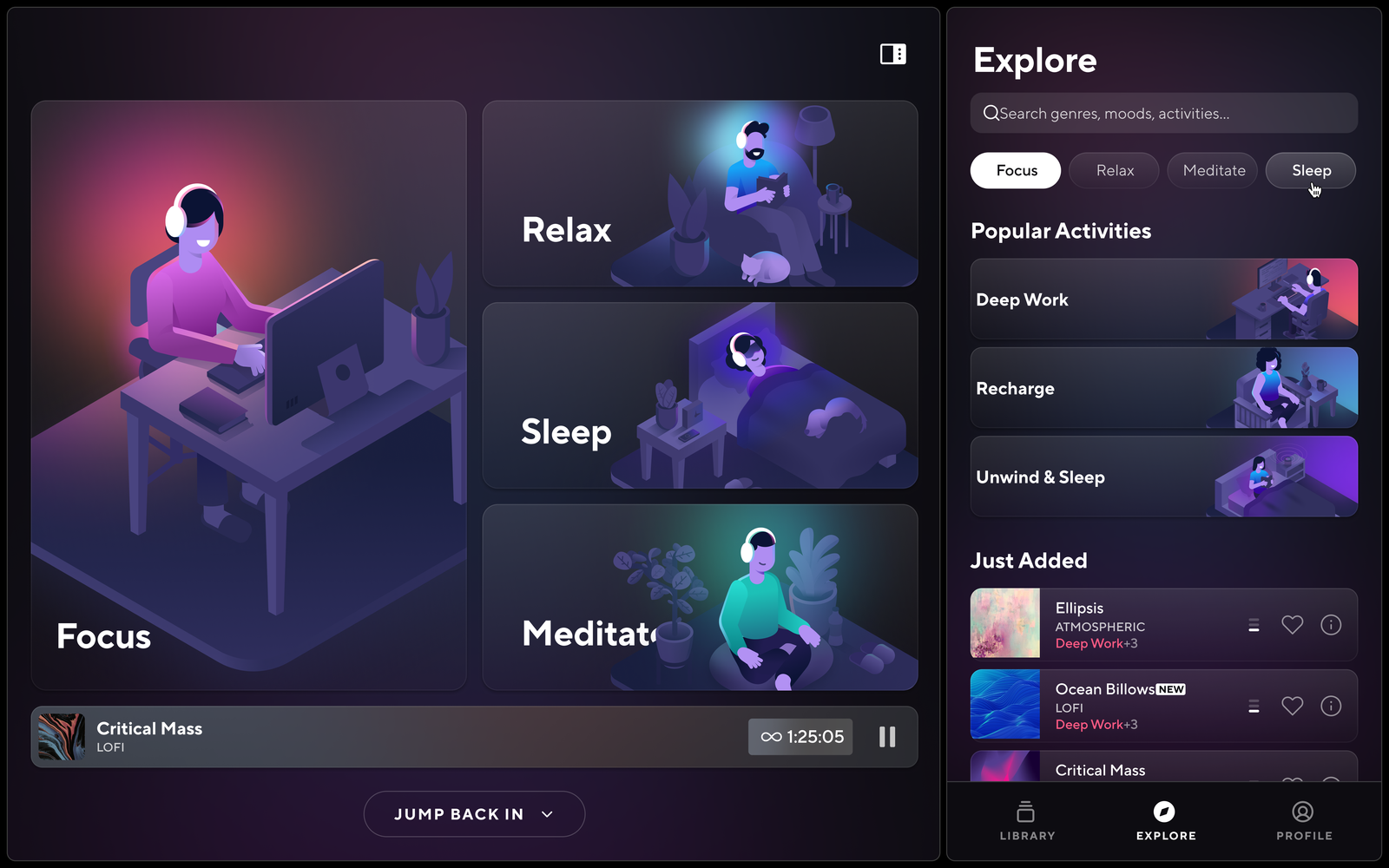
    • Prioritized Focus sessions in IA and UI hierarchy

    • Created wireframes and prototypes of revised Start screen flows

    • Introduced soft motion and updated design system elements for clarity and polish

Solutions & Key Improvements

Focus-first UX: Fast access to Focus sessions based on user patterns
Simplified Start screen: Reduced friction, clearer navigation
Session preview tiles: Visual hierarchy improved decision-making
Micro-interactions: Soft transitions and UI animations to support state change
Design system updates: New components for scalable cross-platform consistency

My Role

  • Led UX research and user journey analysis

  • Designed and tested new Start screen flows

  • Improved Focus session UX through layout, motion, and hierarchy

  • Created design system patterns for mobile and web

  • Collaborated with the PM and engineers to implement improvements in sprints

Impact

      • Increased Focus session starts by [insert % if available]

      • Improved onboarding flow (reduced drop-off by [insert %])

      • Helped unify mobile/web experience with consistent IA and visuals

      • Set groundwork for future personalization features

Tools Used

Figma, Protopie (Interactivity) FigJam, Adobe After Effects (motion), Google Analytics, Amplitude, Notion

Viewports
Viewports 1
Viewports 2
Procrastination

Color palette

/ Foundations
Primary
#005CFF


Electric Blue – Innovation & Trust

Primary
#00FF87


Neon Green – AI-powered energy

Secondary
#8A2BE2


Soft Purple – Creative depth

 Secondary
#FF6F61


Sunset Coral – Warmth & Human Touch

Typography

/ Scales

Typeface
Inter

Usage
Headlines

Omneky’s typeface is simple, bold, easy for everyone to read, and instantly recognizable

AaBbCcDdEeFfGgHhIiJjKkLlMmNnOoPpQqRrSsTtUuVvWwXxYyZz 0123456789

Typeface
Inter

Usage
Headlines

Typeface
Inter

Usage
Headlines

Key Takeaways for Similar Projects:

  1. Invest time in understanding user needs through qualitative research.
  2. Prioritize technical feasibility early to align design with development capabilities.
  3. Use modular design systems to balance scalability with rapid iteration.
  4. Test iteratively with real users to ensure the final product meets their expectations.

Let's get in touch,
I respond fast 🙂

Ready to work together?
Back